

Innovative Strategies for Building Effective Admin Dashboards
Admin dashboards are critical tools for organizations seeking to efficiently manage business processes and streamline data access. A well-designed dashboard not only serves as a command center but also empowers users to make timely, informed decisions, shaping business outcomes. Exploring the latest ideas in admin dashboard UI design can help transform static data displays into actionable intelligence for teams of all sizes.
The key to a successful dashboard is adapting to user needs while keeping it simple and clear. As organizations grow, so do their managers’ and analysts’ needs. A user-focused design keeps dashboards relevant and effective in today’s fast digital environment. Modern dashboards feature clean layouts, easy navigation, and meaningful visuals, reducing barriers to data. They are responsive, suited to today’s varied devices, from desktops to smartphones. Using AI, personalization, and trends like dark mode gives dashboards a professional look and boosts long-term engagement in growing organizations.
User-Centric Design
The foundation of any impactful admin dashboard is a user-centric philosophy. This approach begins by identifying the work habits, expectations, and unique pain points of the dashboard’s primary users. For example, finance managers may require high-level analytics and trends at a glance, whereas technical administrators might prioritize real-time status reports. By segmenting user groups and offering tailored interfaces, companies can accelerate time-to-insight and minimize unnecessary navigation or data overload. Conducting user interviews, surveys, and continuous usability testing remains vital to perfecting this alignment between functionality and user needs.
Minimalism and Clarity
Minimalist dashboards remove distractions and support efficient workflows. Strategic white space, standardized color palettes, and precise typography all work together to create information hierarchies, ensuring what’s most important is front and center. Icons and status indicators can quickly replace verbose text, making the dashboard visually digestible without compromising detail. According to BootstrapDash, reducing visual clutter increases focus, usability, and overall satisfaction in web apps, making minimalism a central principle for dashboard design.
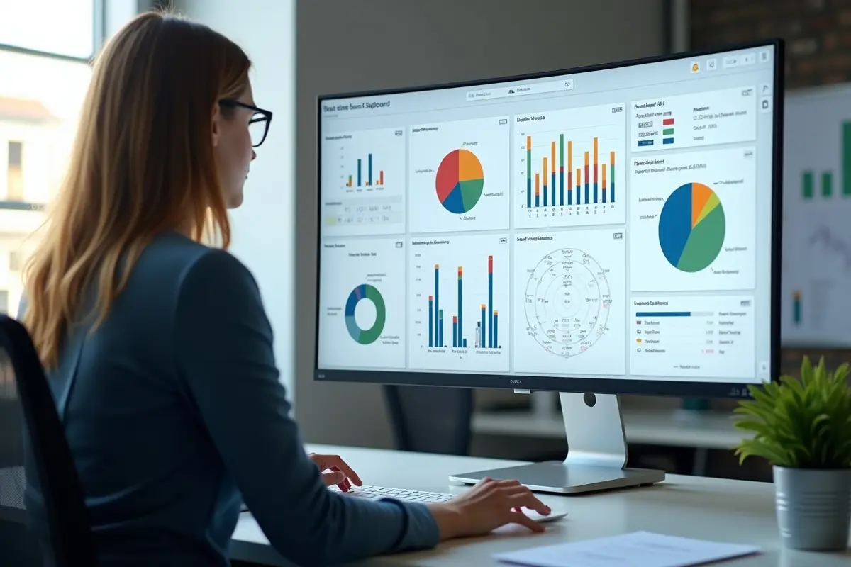
Interactive Data Visualizations
Information comes alive when users can interact with data. Dynamic features, such as drilldowns, tooltips, and time-frame-adjustable charts, empower users to explore metrics at multiple levels. This interactivity fosters intuitive analysis, encouraging users to spot trends and outliers without having to jump between multiple reports or applications. As organizations collect ever-larger datasets, user-friendly data visualization is crucial to transforming complexity into clarity and actionable insights.
Responsive Design
While dashboards began as desktop-only utilities, today’s workforce expects access anywhere, anytime. Responsive dashboard design ensures smooth adaptation across screen sizes, from widescreen monitors in the office to phones during commutes. Navigation elements should collapse or expand based on screen size, and priority data should remain accessible across devices. Investing in responsive layouts guarantees a consistent experience, meeting the needs of users who are increasingly mobile and remote.
AI Integration
Incorporating artificial intelligence into admin dashboards transforms them from passive displays to proactive business tools. AI can automate repetitive monitoring, highlight anomalies, and even predict trends based on historical data. Features such as natural language queries allow users to ask questions directly and receive instant, customized responses. As detailed by arXiv, AI-driven dashboards can improve decision-making by surfacing predictive analytics and automating insights that previously required manual intervention. This fuels a faster, smarter decision process across all organizational levels.
Dark Mode
Providing a dark mode theme offers both aesthetic and functional benefits. Many users, especially those working in low-light environments or over long periods, find that dark backgrounds reduce eye strain and improve battery life on mobile devices. Dark mode also delivers a sleek, modern look that matches current design trends, making it increasingly expected in professional tools. Including both light and dark theme options allows users to select their preferred view, increasing comfort and adoption.
Personalization
Customization capabilities greatly enhance dashboard utility and user engagement. Allowing users to pin their most-used widgets, rearrange layouts, or select favorite data feeds puts control in their hands. This not only boosts productivity but also creates a sense of ownership over the admin experience, fostering repeat engagement. Personalization options can include notifications, custom reports, and the ability to save filter settings for quick access during future sessions.
Conclusion
Building an effective admin dashboard requires deliberate strategy, ongoing user feedback, and adoption of the latest design and technology trends. Prioritizing clarity, interactivity, and responsiveness ensures every dashboard becomes a vital business asset that drives efficiency and better decision-making. By incorporating user-centric design, minimalism, advanced AI, and personalization, organizations can create platforms that not only present data effectively but also inspire confident, informed action for teams at every level.


0